Kristie Callander
Mobile Application Proposal
Playground Explorer was the capstone project for the UX Design Certification course I completed with Springboard.com. Learning methodologies covering UX discovery, design, and validation, I developed a mobile app concept that would allow users to discover playgrounds in new locations. This project is still shown today as a successful UX project for new students to study.
My Role: Visionary, UX/UI Designer, and Researcher
Mentor: Andre Martin

The Challenge
Finding safe and convenient playgrounds.
You’re taking a road trip with your kids and two hours in they are hungry and want to get out of the car. You want to find a place they can run around so they will hopefully sleep and you also want to find a stop that will have food nearby. But where? You don’t know which exit would be the best.
Playground Explorer is a solution that finds playgrounds and nearby restaurants in your current town, when you are visiting a new town, and when you’re taking a road trip and need to have a quick stop to let the kids burn off energy. Playground Explorer is a playground finder with GPS, navigation, and a restaurant locator all in one!
Discovery
Research - Interviews & Surveys
In-person interviews were conducted as well as a survey in which parents and caregivers were asked about their experiences with playgrounds, traveling with children - particularly on road trips, and their app usage and interactions - like check-in features.
Issues were discovered which had not been thought of before that influenced the final app prototype; knowing of restaurant or food options nearby is important, especially when stopping during a road trip and knowing if the playground was wet or muddy from previous weather. Other discoveries included:

How the Others Stack Up - Usability Heuristics Analysis


Using the guidelines set out by the Nielsen Norman Group, competitor apps were evaluated on their user interface. Evaluating how other apps use consistency and standards, recognition, user control and freedom, and aesthetic and minimalist design was a great way to learn what to do and what not to do with Playground Explorer.
Insights discovered:
-
Use the pulsing blue dot for user’s current location
-
Keep the map in the forefront, large and pannable
-
Use familiar navigation icons, like the paper airplane, so the user can easily get back to their current location
-
Keep only relevant icons and features on the main screen
-
Allow users to easily toggle features on and off
-
Make sure there is enough details about the playgrounds.
Meet the Peeps - Persona & Empathy Maps
To gain a better understanding of Playground Explorer users, personas and empathy maps were created by people interviewed and surveyed. This helped to keep the project focused on the real users and their struggles of parenting.


Design
Getting Down to Brass Tacks - The MVP is VIP
Now that the research was conducted and insights were gained about the users and competitor apps, the next step was to dive into the user stories to develop a Minimum Viable Product. The user stories were created around the same three focus areas of the app that the interviews were conducted; playground, travel and app usage. These five user stories were critical to the design of the prototype:
-
As a parent, I want to find playgrounds on a map throughout the city so I can provide new adventures for my children.
-
As a parent, I want to know what type of equipment is at the playground so I know it’s age-appropriate for my children.
-
As a parent, I would like to know about indoor playgrounds as an alternative for when the weather is inclement.
-
As a parent, I would like to know whether the playground is too wet to play on so I don’t waste my time traveling there.
-
As a parent, I want to find restaurants near playgrounds so when road tripping we only have to make one stop.
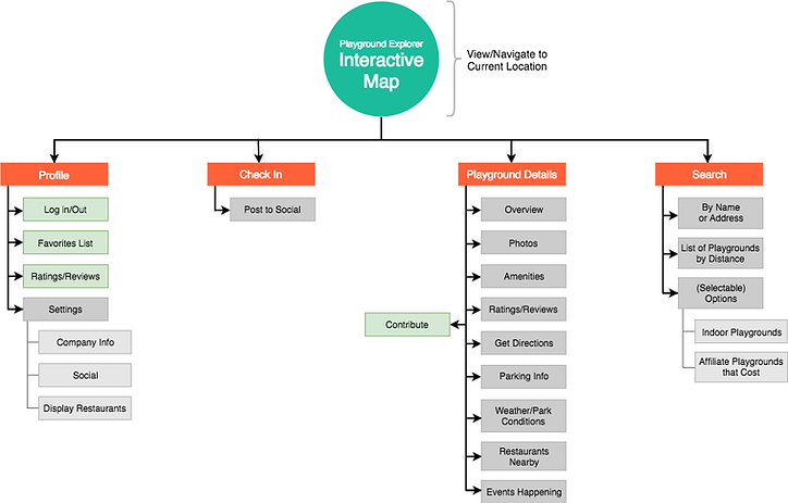
Making Sense of It All - Information Architecture
After the basic needs of the app were determined, the next step was to create a flow that the user could understand and navigate. Using OptimalSort, potential users were asked to organize the user stories into categories that made the most sense to them in a card sorting activity.
Overall, the group came up with categories that validated the original theory of the different core app functions, such as park discovery/search, park details, log in, and social. There were some discrepancies in some functions that required logging in versus not logging in. User feedback was mostly positive with the parents giving ideas on things like monetizing certain features of the app, expressing how they see certain features as filters, and wanting the app to allow users to be part of a community. There was also some constructive feedback that there were some features that were not needed altogether. From there, a general site map was created to visualize the groupings.

%20(1).png)
User Flows
Working with the personas and being empathetic to their needs, user flows were created to understand how they would individually work through the app to solve their problems. The user flows were sketched out, refined graphically, and then iterated after receiving feedback.


Sketching, Wireframing, and Prototyping… Oh My!


Quickly sketching out app frames and features allowed for numerous iterations and refinement in the initial design of the app. The graphical wireframing stage also allowed for more refinement as ‘feature creep’ was identified and removed. The idea of an MVP was close at hand so ‘extras’ were dropped.
Using InVision, a basic prototype was developed. Even during this stage, more reworking and refinement was done as seeing the prototype in action helped make more sense of the overall user flow and what was needed, or not needed, to complete certain tasks.
The prototype can be found here: https://invis.io/D4B9V3MYX

Lookin' Good - UI Style Guide
Validation
The Acceptance - User Testing
In this final piece of the project, a test plan was created to have users test and validate. The testers were given some scenarios to work through as well as directed instructions. The testers, who were tech savvy parents, had a very favorable opinion of the app and all the features it supported. Some insights discovered were that while the some of the users had no problem with the search icon to initiate the navigation function, others did not immediately get it. As with most apps, after the users worked through the first scenario they had fewer issues with the other scenarios because they were more familiar with the app and remembered seeing certain features. As with previous research learnings, all the parents really appreciated the restaurant locator feature. They also felt that the weather feature was a nice touch but felt it needed to be further developed and have more information.
Overall, parents that recruited for either the research phase, the design phase, or the validation phase really liked the idea of this app and said they would use it if it were to be developed.
The full project documentation, including sketches and deeper insights, can be found here: https://goo.gl/6b2CXT


